Every company is a brand, but only the best companies (Apple, Nike, MailChimp) understand what theirs is. As we better understand the PowerDMS brand, collectively, we can deliver a more consistent, higher quality brand experience that increases sales and retention.
The branding elements seen below – promise, differentiation, values, and archetypes – have been approved by PowerDMS leadership in 2020 and act as the foundation of our brand, informing the content and design decisions made in these brand guidelines.
These brand guidelines act as a living document. The purpose isn’t to restrict, but rather to help PowerDMS deliver a better, more consistent customer experience – be it through email, videos, website, landing pages, ads, etc.


Statement of Differentiation
This statement identifies the things that only PowerDMS does. It helps us understand our brand’s points-of-difference, identify market opportunities, and promote a consistent message.
- What: The only policy management platform
- How: that creates a connected ecosystem where compliance comes to life
- Who: for organizational leaders
- Where: across the Western Hemisphere
- Why: who need a single, unified solution for reducing risk
- When: in an era of increasing regulatory scrutiny
Brand Design Values
These values guide the creation of the brand's design elements, such as color palette, typography, iconography, support graphics, and overall style. They are intended to ensure consistency across all visual representations of our brand.
- Self-Explanatory Concepts
- Intuitive Naming Conventions
- Simplicity in Design and Language
- Universal Appeal and Understanding
- Avoidance of Acronyms and Abbreviations
- Consistency Across Platforms
- Showcase Authentic Innovation
Ensure that all design concepts and thematic elements are immediately recognizable and do not require additional context or explanation. The idea should be universally understood by the target audience, transcending cultural and language barriers where possible.
All product names, service titles, or any other branded terminology should be straightforward and self-descriptive. They should clearly communicate their purpose or function, avoiding obscure references or complex jargon that might confuse the audience.
Aim for simplicity in both visual design and language use. Avoid overcomplicated designs or wordy descriptions that could detract from the immediate understanding of the concept or name.
Consider the broad diversity of your audience. Images should always strive to reflect that diversity, as well as feel authentic and relatable. Names and concepts should not only be easy to understand but also culturally sensitive and non-offensive, appealing to a wide range of users.
Unless widely recognized, avoid using acronyms or abbreviations that could be unclear to a new customer or external audience.
Maintain this clarity and intuitiveness across all platforms and mediums, ensuring a cohesive and understandable brand experience whether in digital, print, or physical presentations.
Cheesy, posed stock photos and clip-art/illustrations are to be avoided in all cases, as are images that show outdated paper processes like handed-in resumes or printed-out charts. Focus on relevant technology, and If a computer screen or interface is shown, use a mockup of our actual application.

Primary Archetype:
Mentor
As the Mentor, we empower others to reach their highest potential. That goes for customers and coworkers. We step alongside one another, bringing wisdom and objectivity to every situation. Every challenge. Responsive and hard working, we’re always present when needed. By caring and listening attentively, we become a trusted teacher and partner.

Secondary Archetype: Pioneer
As the Pioneer, we like to be first. The first to market. The first to discover a new technology or concept. We are thought leaders. We are curious and practical, always looking to find solutions to everyday problems. We are independent thinkers, willing to break convention to better serve our customers. With a zest for life, we exude energy and optimism.
Brand Voice
Our brand voice is what we say and how we say it. In other words, it’s our tone of voice and set of guidelines for writing consistent content, regardless of who (from any department) is writing customer-facing content. By following these guidelines, we can create a more consistent experience for customers.

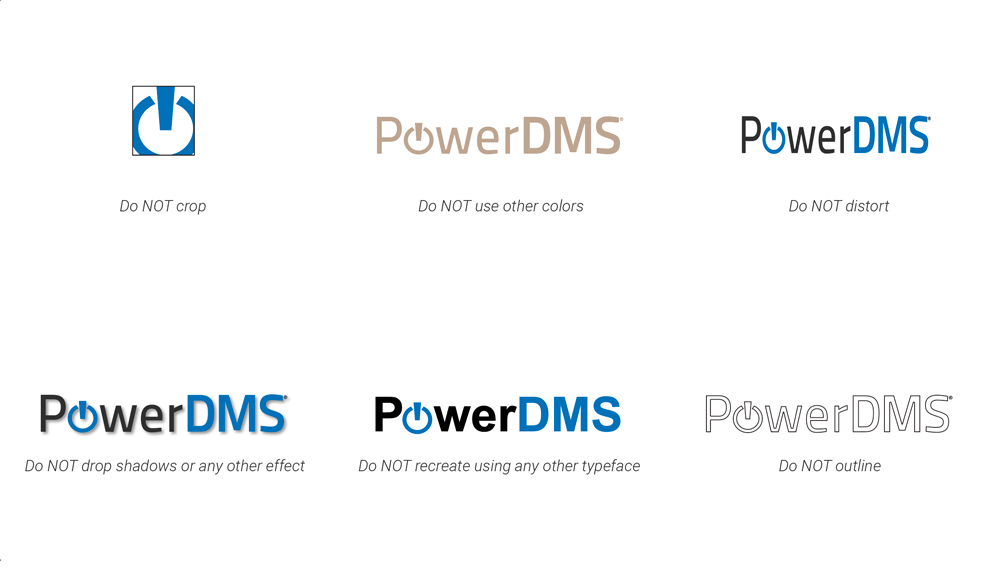
Logo Guidelines
Always use the logos provided and do not re-create
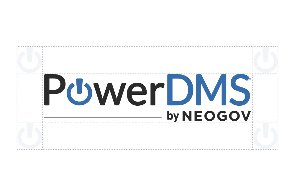
- Primary Logo
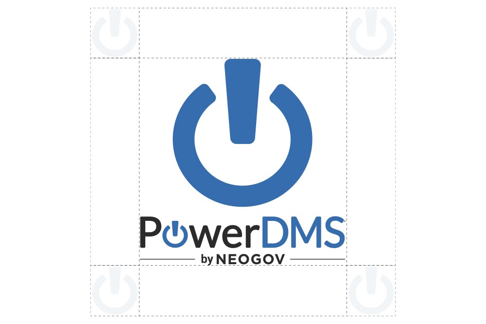
- Stacked Logo
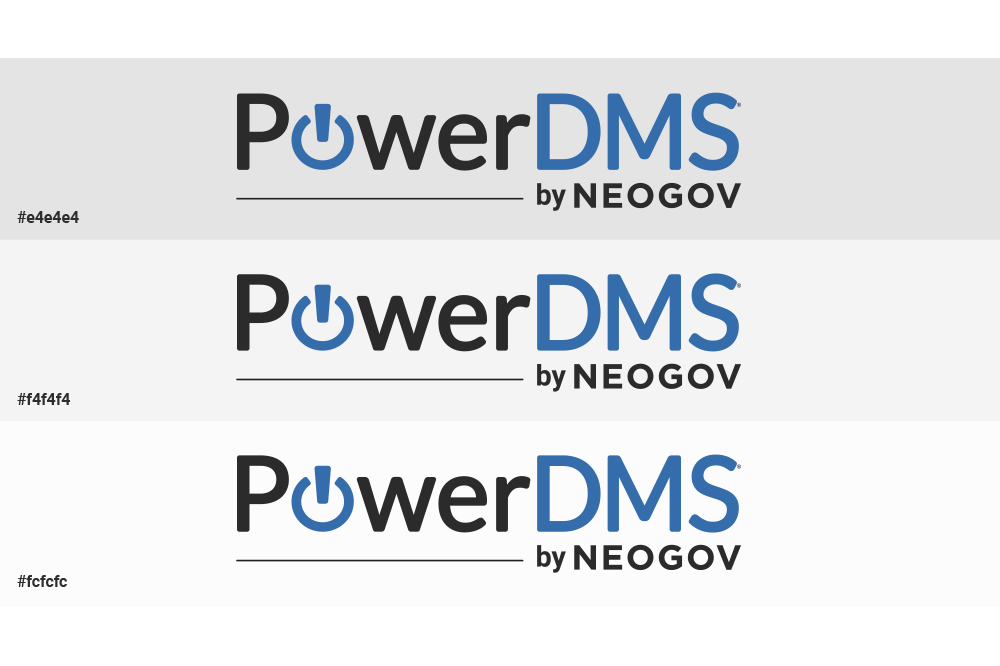
- Logo Background Use
- logo Misuse
The stacked logo is for large-scale use. Avoid using at small sizes, as it can become illegible.
The full-color logos should be used only on white, or shades of light grey backgrounds. Avoid using full-color logos on photographs unless the logo sits on a black or white area of the image.

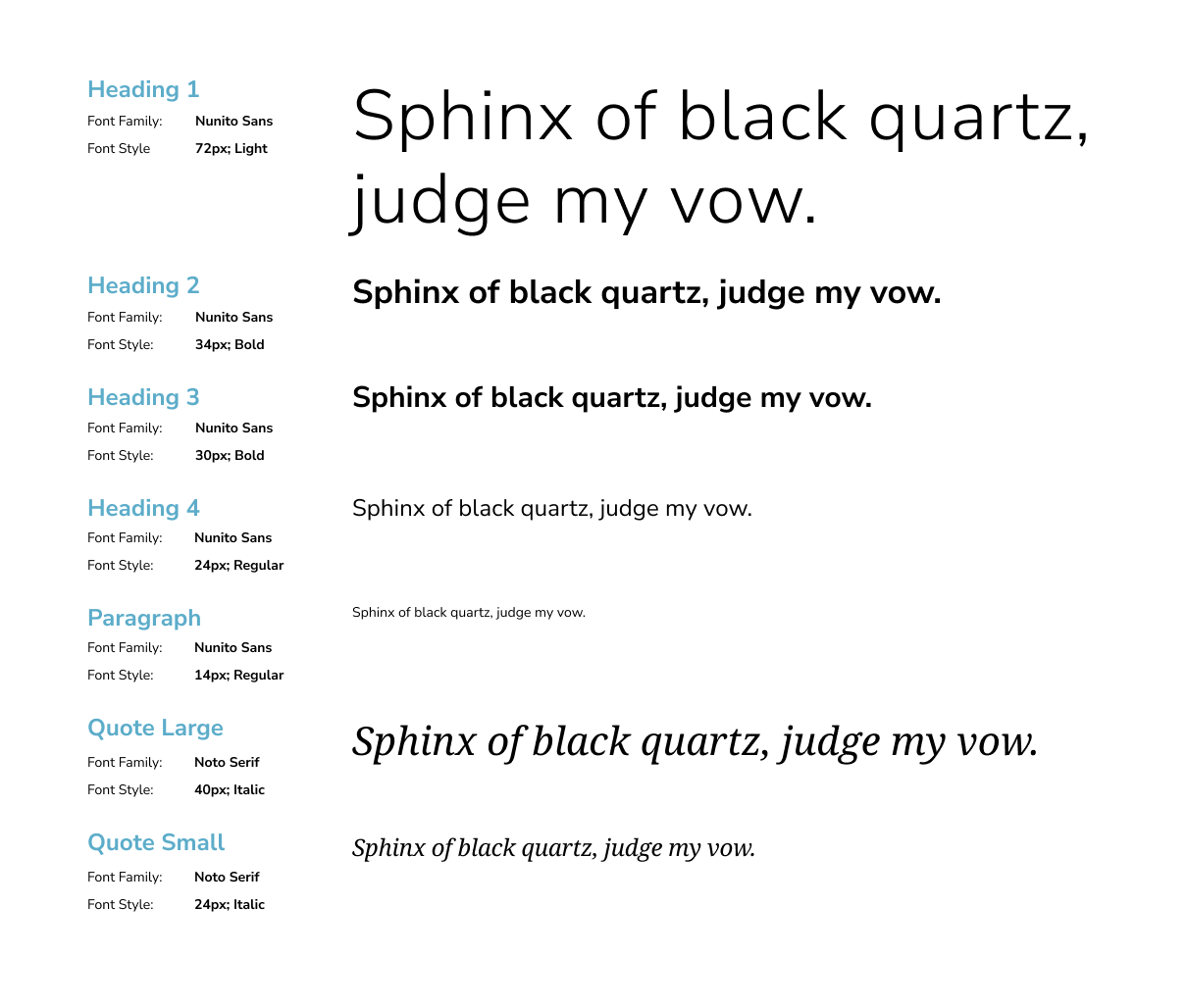
Core Colors
Use these color proportions in any layout or collateral design. Bright Blue, Teal, Yellow and Green can be used as accent or primary colors. Use only black or white text on core colors.
Do not interchange the use of black and white text according to preference, as these color combinations are specifically approved for accessibility.
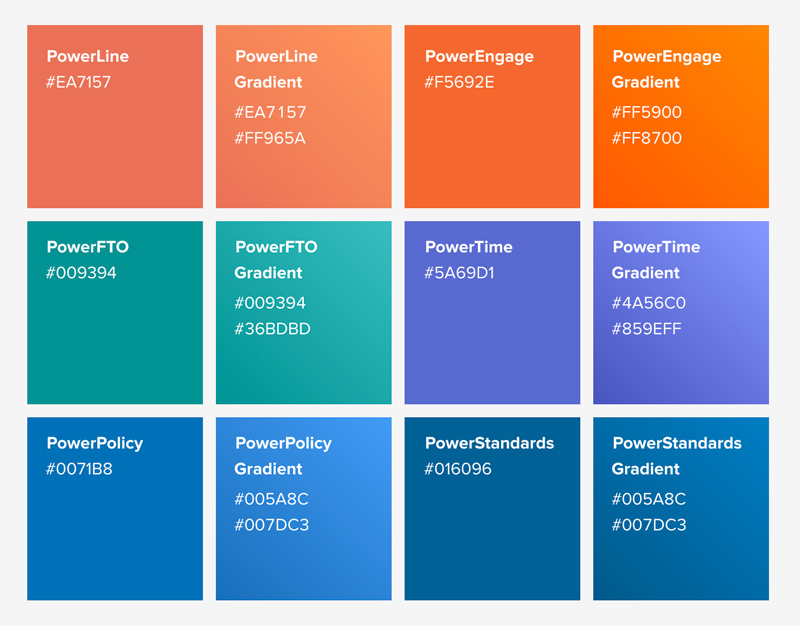
Secondary & Product Colors
Use these color proportions as accents and secondary colors in any layout or collateral design. When designing for one specific product, use the product color as the main color.
When using a gradient, the gradient must be liner and go from the bottom left-hand corner to the top right with the darkest color on the bottom left.
Visual Elements
- App Graphics
- Icons
- Photography
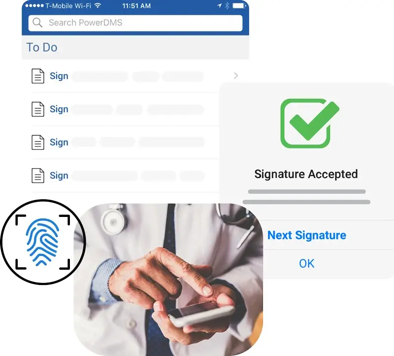
APP GRAPHICS
Application Illustrations
We want to show our software at every possible opportunity. These illustrations need to always coincide with context. These can be created and used alongside any copy that is specific to a solution, benefit, and or feature.
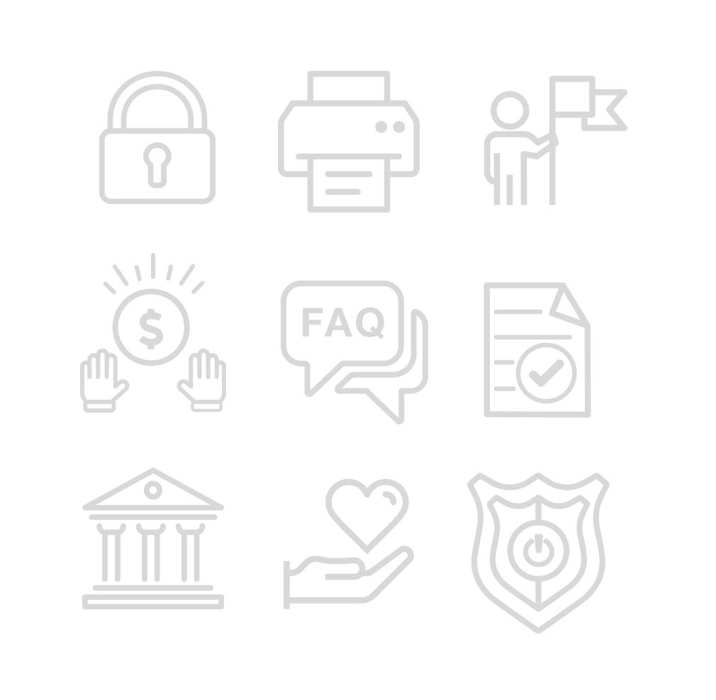
ICONS
Iconography
Icons should be used sparingly. Iconography can be used in infographics, ebooks, covers, blog posts, slide decks (when needed), etc. Do not use stock illustrations unless altered and approved.
Ensure that all design concepts and thematic elements are immediately recognizable and do not require additional context or explanation. The idea should be universally understood by the target audience, transcending cultural and language barriers where possible.
The stroke should be black or DMS blue and should not vary in width when scaled.

PHOTOGRAPHY
Lifestyle Imagery
Stock photos can be used in infographics, ebooks, covers, blog posts, slide decks (when needed), etc. Stock photos are to be complementary and abstract not literal whenever possible.
Cheesy, posed stock photos and clip-art/illustrations are to be avoided in all cases, as are images that show outdated paper processes like handed-in resumes or printed-out charts. Focus on relevant technology, and If a computer screen or interface is shown, use a mockup of our actual application.
Use ONLY real unstaged photos when incorporating lifestyle imagery of the industries we serve.